Table of Contents
Just a couple months ago I gave my website a redesign, and since then I've been silently pushing updates to it while also building it from scratch.
Why?
Why not? Actually, yeah, there might be reasons to not build it from scratch, but as the website grew and I needed to update components and stuff, I was feeling overwhelmed by how it was organized.
So I think an update was due, but I didn't want to work on top of the mess that I had, so I decided to start from scratch.
As I keep learning new tools, frameworks and libraries, I keep finding room for improvements to my existing projects, but overall for the one that I find the most important: this website.
Let me walk you through the changes and updates I've done to this website during the last couple months...
What changed?
CSS modules → Styled Components → Tailwind
I had CSS modules for every single component in my website. This was ok but I started noticing that my CSS code was frequently being duplicated as I kept using it in another (similar) components.
So, as I recently learnt about using Styled Components, specifically with emotion.sh, I saw that as an opportunity to use it and be able to create components that extended from other components, so that I didn't need to rewrite styles for all, but just override them if needed.
I used this for a while, and everything was working pretty good. Anyways, about a week ago, I decided to give
tailwind css a try.
I honestly don't like it much for a specific reason: the class attribute in html code is way too long and I don't like that.
So I started to look around on ways to use and learn about tailwind, while keeping a styled components syntax. And that's when I found
twin.macro. It allows to take advantage of all the classes and utilities from tailwind, while
writing components like you would with styled components.
The syntax is pretty simple and the code will be short. Plus, it compiles the tailwind classes into css with styled components, so the generated html is as clean as it can be.
Here's an example for a styled link with twin.macro:
import tw from 'twin.macro';

const StyledLink = tw.a`
  font-medium
  inline-block
  text-accent
  hocus:(text-accent-dark dark:text-accent-light)
`;
It also comes with a lot of utilities to write less code, like hocus so you can style hover and focus at the same time. Or being able to
write css directly within the tw string, like
--custom-color[#4285f4]
It's pretty powerful to be honest. And now I put both tailwind and styled components into practice, while reducing a lot of code in my website. You can check a recent Pull Request I did for this. The difference is huge.

Additionally, I'd like to mention I was planning on creating some kind of design system for this website, and have docs with Storybook. I did it with the first components I created, but at the end it was just too much work to maintain all of that, so it's been removed.
Update:
As much as I liketwin.macro, I noticed a performance decrease (going down to ~65 points), probably due to how complex and custom this website's css is.
So I have decided to revert everything to justemotionstyled components, in favor of better performance, especifically for mobile devices, and now it gets ~20 extra points.
Here's another Pull Request with those changes.
Adios, localization
I had localization setup in my previous website for a while. I wanted it to be available for Spanish speakers too (which is my native language), but maintaining content in both languages, especially for blog posts, was a lot of work and time spent, and I didn't really have the will to do that.
It was disabled a while ago in that website, but now is completely gone.
No more plain, simple and boring Markdown
For a long while, I was using simple markdown for my blog posts, but as I wanted to build simple pages without having to write a lot of react code, I saw MDX could suffice and noticed that I was really missing on the features it offers, so I decided it was time to give it a try.
Lee Rob's website has always been a reference for mine, and its blog is built using MDX. When I checked the source code to learn how it was doing MDX and handling it with NextJS, I noticed he uses contentlayer which transforms simple content into data, like JavaScript objects and arrays, even typed, so that it's easy to use within your site.
It's also pretty flexible as it allows transforming fields or creating new ones.
All of that, has made me like MDX a lot and made the transition super easy, and also even allowed to easily setup an RSS feed for my website.
No more forms
The service I was using (for the contact and blog ideas forms) seems kind of abandoned, there's no support and it even started failing recently.
Also, while looking into other personal websites and portfolios, many of them don't have a contact form, so I guess it's ok to not have it.
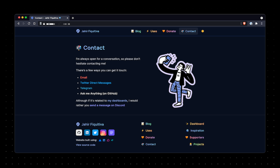
Anyways, the contact page is still available and features links for different ways to contact me, including a link to GitHub discussions in case you want to ask me anything in a less formal way. And it also includes beautiful illustrations from open doodles.
What's new?
While building the new website, I noticed some complications within components and styles, so I tried to minimize those and make my code cleaner. I also updated a few styles to make the website look better too. Minor tweaks.
Besides that, here's what's new:
Name pronunciation
Many times before, I've dealt with people mispronouncing my name, and although I'm mostly ok with that, I thought it would be nice to have this. So if you go to the home page and click on my name you will hear how to pronounce my name correctly.
Dashboard
I previously had a simple music dashboard, only listing the song I'm currently listening to, plus the top tracks (i.e. the songs I've listened the most).
I found lanyard, an api that provides your discord activity information, and thought it was pretty cool to show all that activity in real time.
To add a bit more to it, I put a few counters similar to what Lee Rob has.
Here's the result.
Simpler project cards
The previous design had some flaws. Images being positioned absolutely, caused some issues with some specific screen sizes. Here's what they used to look like:
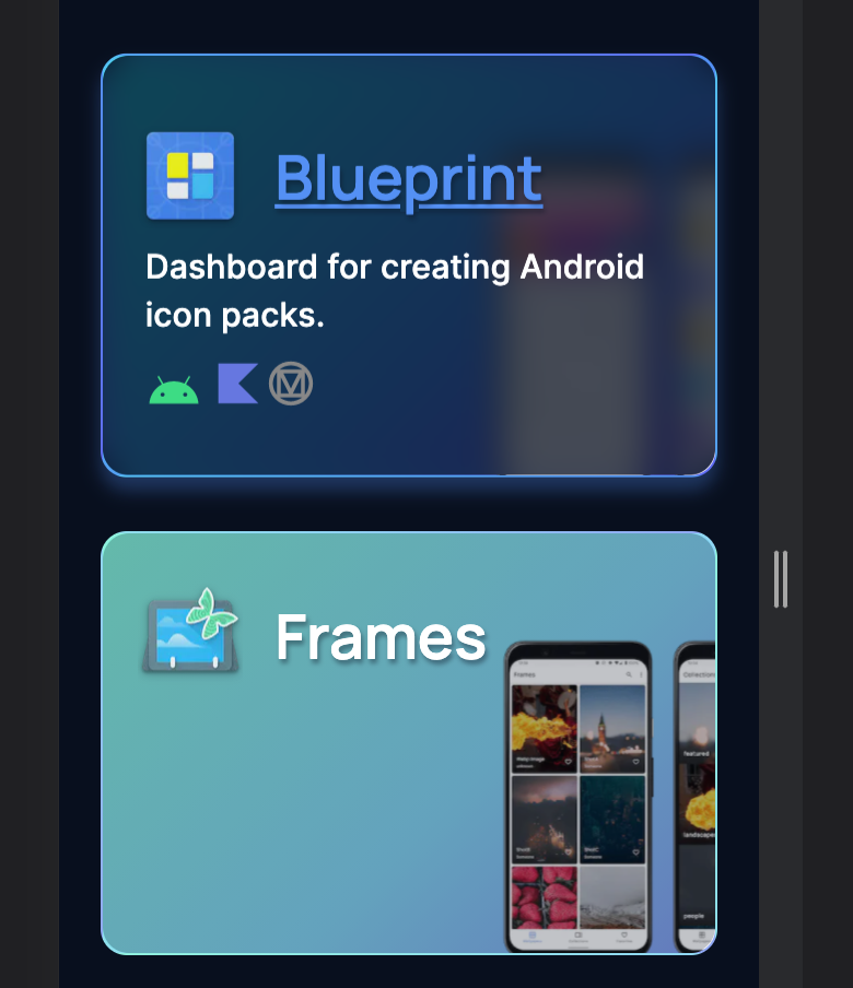
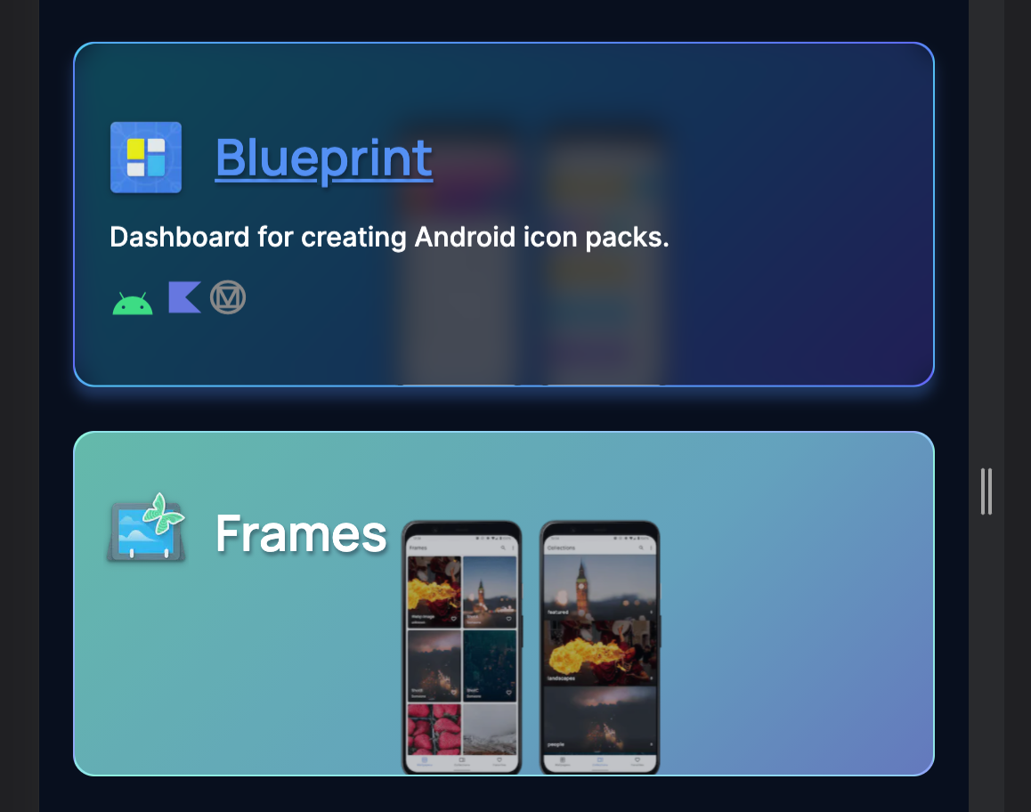
And this is how they look now:

New blog posts cards
I also updated the blog posts cards because I thought they were actually taking and wasting space.
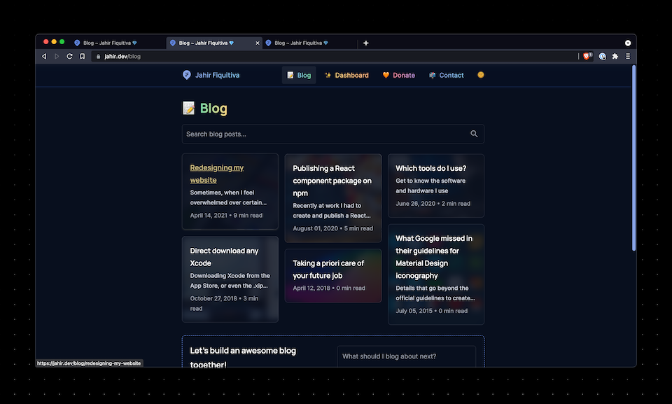
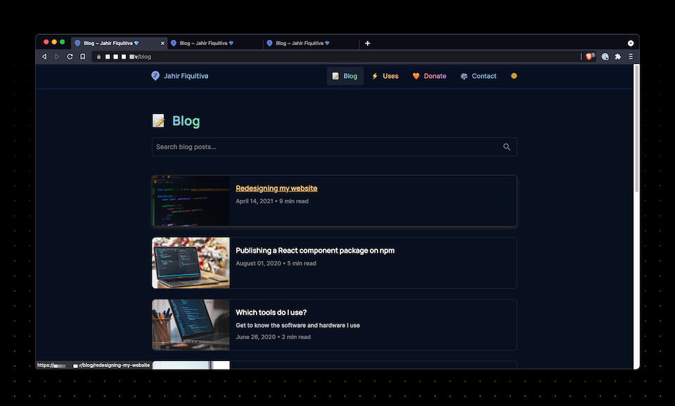
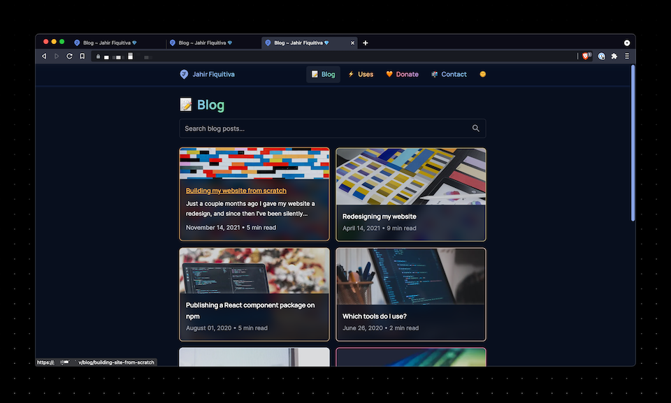
Here's what they looked like before, compared to what they looked in a first iteration.
As you can see, I started using the blog post hero image as the card background, covered by a cool blurry scrim. Anyways, this design didn't convince me as I also wanted the hero to be more visible. Therefore, I changed it again, to what the current look is:
What's next?
I probably will keep this website as you're seeing it for a while. I already spent a lot of time working on the new stuff and writing everything from scratch, and I need to put efforts into some other things.
Anyways, I do have a couple ideas for this website, that I hope I can make happen eventually. And they should be easier to implement now with the recent changes, especially with MDX.
Final notes
This website is now open-source and open to contributions. If you can help by fixing typos here and there, or even improving the site performance, that would be amazing and highly appreciated.
Here's the link to the GitHub repo
That's it for now ... See ya! 👋

